Concurrency Usage Report
The Usage report helps you understand how your organization uses Sauce Labs concurrency resources and compare usage with your subscription limits. You can review usage at the organization or team level, compare usage across teams, and analyze how concurrency changes over time.
The report provides usage data for Virtual Devices and Real Devices, helping you understand testing patterns and identify periods when concurrency usage approaches your subscription limit.
Access Usage Report
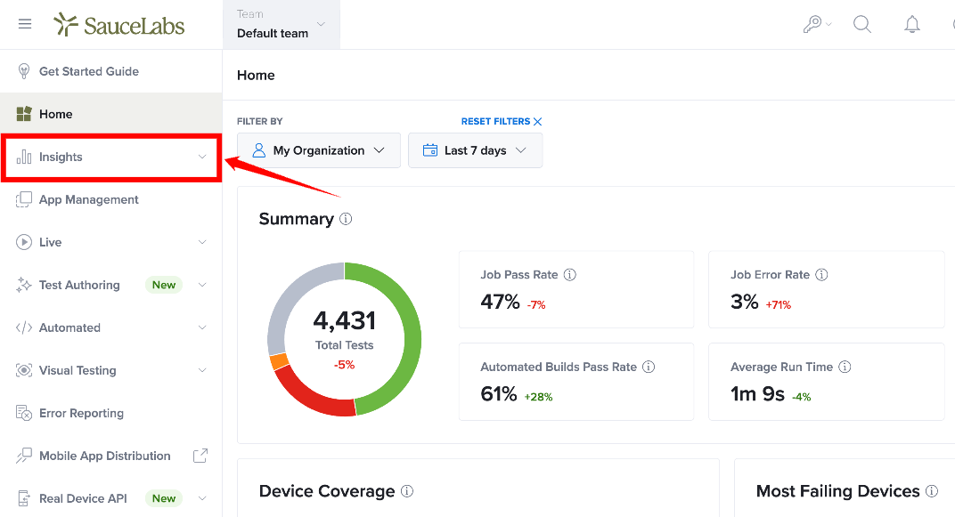
Step 1: Sign in to your Sauce Labs account. From the left-side navigation, locate Insights and click it to expand the available options.
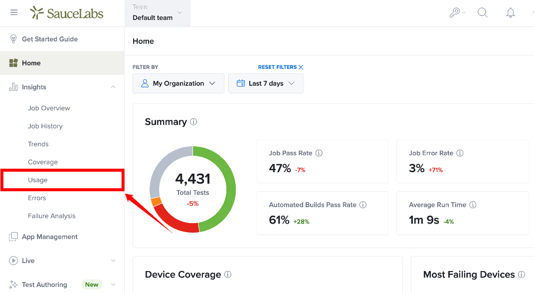
Step 2: From the expanded Insights menu, select Usage.
Step 3: The Usage page opens with the Test Concurrency view selected by default.
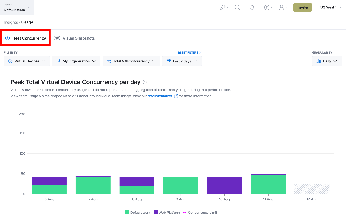
The report calculates the maximum concurrency usage during each selected time interval and displays the data using stacked bars. Each team with usage greater than zero during the selected period contributes to the displayed usage.
Test Concurrency
The Test Concurrency view shows the maximum concurrency usage during the selected reporting period. The report presents concurrency usage in a chart and a table. The chart provides a visual representation of usage, while the table provides the corresponding usage values for each reporting interval.
The report can also show how individual teams contribute to the organization's overall concurrency usage.
Understand the Concurrency Chart
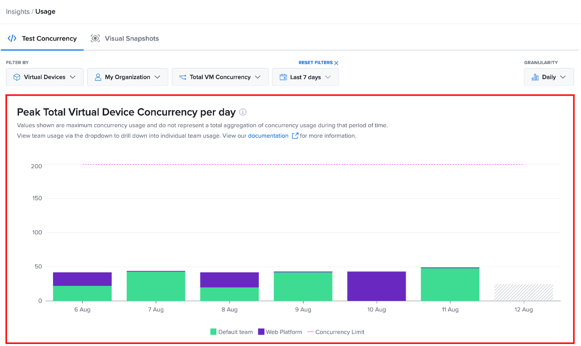
The concurrency chart displays peak usage for each reporting interval. Each bar represents the maximum concurrency usage reached during that interval. The bars can be divided into sections to show the contribution from different teams.
The chart also displays the organization's Concurrency Limit as a reference line. You can use this line to compare peak concurrency usage with the available limit.
For example, if the chart shows a peak usage of 49 and the concurrency limit is 200, the organization reached a peak of 49 concurrent executions against a limit of 200 during that interval.
The values shown represent maximum concurrency usage. They do not represent the total aggregation of concurrency usage during the selected period.
Understand the Concurrency Data Table
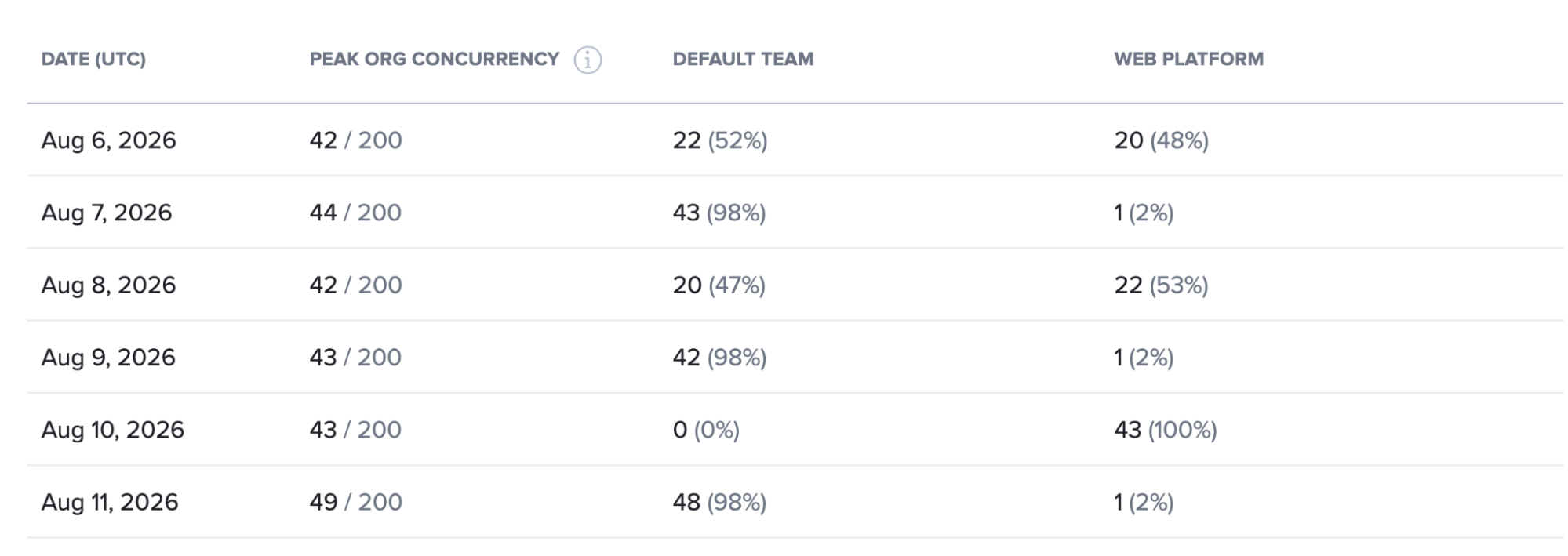
The table below the chart provides a detailed breakdown of the concurrency data, including the reporting date, peak organization concurrency, and each team's contribution to the organization's peak usage.
| Column | Description |
|---|---|
| Date (UTC) | Displays the date for the reported concurrency usage. |
| Peak Org Concurrency | Displays the organization's maximum concurrency for the reporting period and the applicable concurrency limit. |
| Default Team | Displays the Default Team's peak concurrency usage and its percentage contribution to the organization's peak concurrency. |
| Web Platform | Displays the Web Platform's peak concurrency usage and its percentage contribution to the organization's peak concurrency. |
For example:
| Date (UTC) | Peak Org Concurrency | Default Team | Web Platform |
|---|---|---|---|
| Aug 6, 2026 | 42 / 200 | 22 (52%) | 20 (48%) |
| Aug 7, 2026 | 44 / 200 | 43 (98%) | 1 (2%) |
| Aug 8, 2026 | 42 / 200 | 20 (47%) | 22 (53%) |
| Aug 9, 2026 | 43 / 200 | 42 (98%) | 1 (2%) |
| Aug 10, 2026 | 43 / 200 | 0 (0%) | 43 (100%) |
| Aug 11, 2026 | 49 / 200 | 48 (98%) | 1 (2%) |
For example, 49 / 200 means that the organization reached a peak concurrency of 49 against a concurrency limit of 200 during that reporting period.
The percentage shown next to each team indicates that team's contribution to the organization's peak concurrency.
Compare Team Concurrency Usage
The Usage report breaks down concurrency usage by team, allowing you to see how different teams contribute to the organization's usage.
For example, if the organization reaches a peak concurrency of 42, and the Default team accounts for 22 (52%), that team contributed 22 concurrent executions, representing 52% of the organization's peak concurrency.
The chart and table allow you to compare team contributions across different reporting periods.
Change the Usage Granularity
Use the Granularity control to determine how concurrency usage data is grouped and displayed in the Usage report. Changing the granularity does not change the underlying usage data; it changes the time interval used to present the data.
In the Test Concurrency view, locate the Granularity dropdown in the upper-right corner of the report and select the time interval you want to use, such as Daily.

For example, when you select Daily, the report groups the concurrency data by day. Each bar in the chart represents the peak concurrency usage for that day, and the table below the chart displays the corresponding daily values.
View Visual Snapshot Usage
Visual Snapshots are snapshots generated from your visual testing activity. The Visual Snapshots view in the Usage report shows how many snapshots were generated during a selected reporting period and how that usage is distributed across teams.
Step 1: From the Usage page, select Visual Snapshots at the top of the report. The Visual Snapshots report opens and displays a chart and a data table for the selected reporting period.
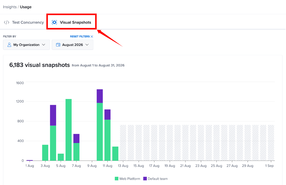
Step 2: Review the Visual Snapshots chart to see how snapshot usage changes over time. Each bar represents the number of snapshots generated during the corresponding period. When multiple teams generate snapshots, the bar is divided into sections showing each team's contribution.
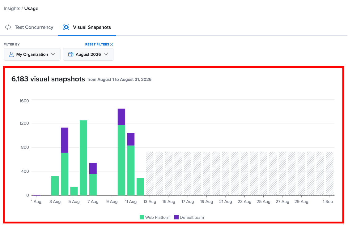
For example, if one team generated most of the snapshots on a particular date, its section of the bar represents the larger portion of the total usage.
Review Visual Snapshot Usage in the Table
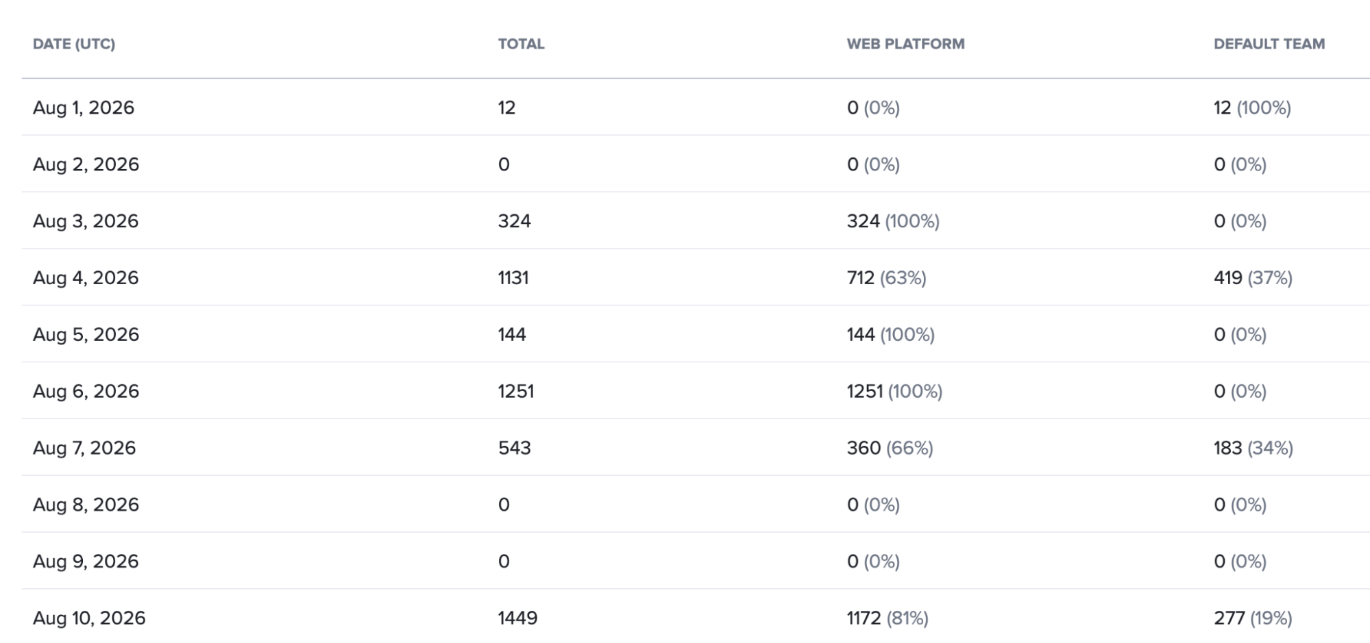
The table below the chart provides a detailed breakdown of Visual Snapshot usage for each date.
| Column | Description |
|---|---|
| Date (UTC) | Displays the date for the reported Visual Snapshot usage. |
| Total | Displays the total number of Visual Snapshots generated on that date. |
| Web Platform | Displays the number and percentage of Visual Snapshots generated by the Web Platform. |
| Default Team | Displays the number and percentage of Visual Snapshots generated by the Default Team. |
For example, the table may display the following data:
| Date (UTC) | Total | Web Platform | Default Team |
|---|---|---|---|
| Aug 1, 2026 | 12 | 0 (0%) | 12 (100%) |
| Aug 2, 2026 | 0 | 0 (0%) | 0 (0%) |
| Aug 3, 2026 | 324 | 324 (100%) | 0 (0%) |
| Aug 4, 2026 | 1,131 | 712 (63%) | 419 (37%) |
| Aug 5, 2026 | 144 | 144 (100%) | 0 (0%) |
| Aug 6, 2026 | 1,251 | 1,251 (100%) | 0 (0%) |
The Total column represents the overall number of Visual Snapshots generated on a date. The team columns show how that total is distributed across the teams.
Review Visual Snapshot Usage Trends
Use the chart and table together to review Visual Snapshot usage over time. The chart provides a visual view of changes in usage, while the table provides the exact number of snapshots generated and each team's contribution for each date.
For information about narrowing the usage data displayed in the report, see Filter Controls for Concurrency Usage.