Pass/Fail Rate Trends
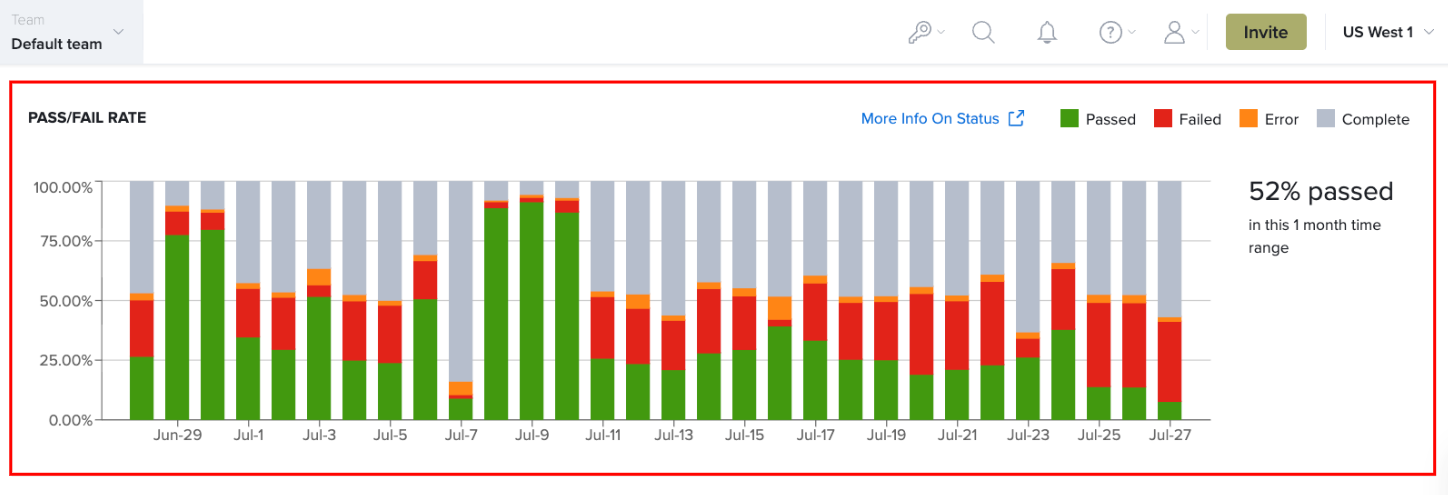
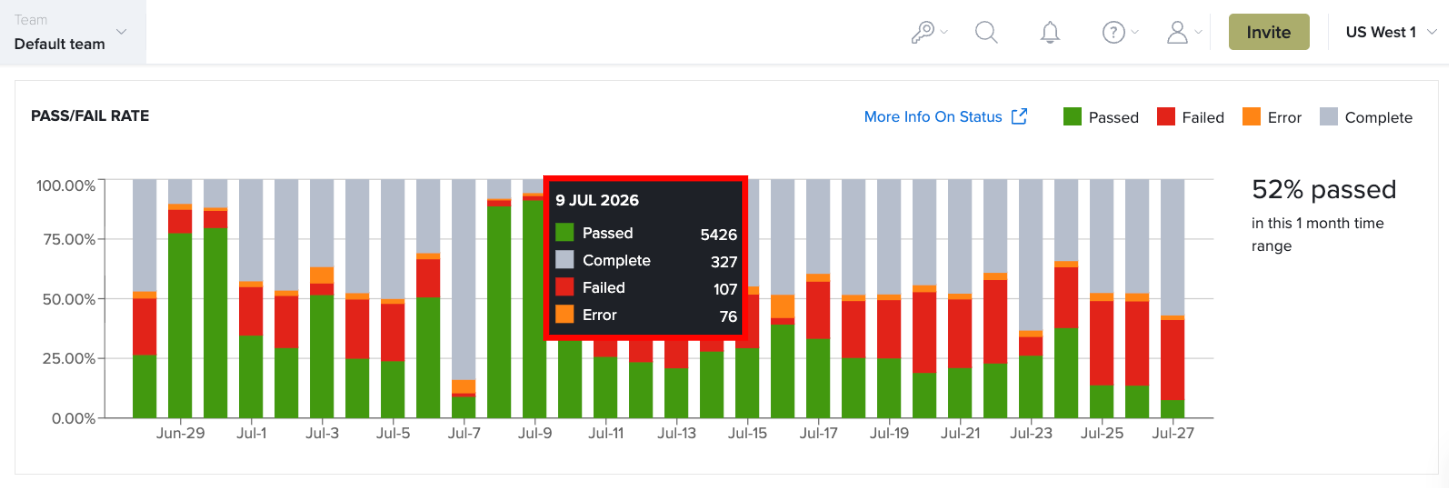
The Pass/Fail Rate graph displays the percentage distribution of test outcomes for each reporting interval in the selected time period. Each vertical bar represents 100% of the tests executed during that interval and is divided into colored segments based on the test outcome.
The graph helps you compare changes in test quality over time by showing how the percentage of passed, failed, errored, and completed tests varies across each reporting interval.
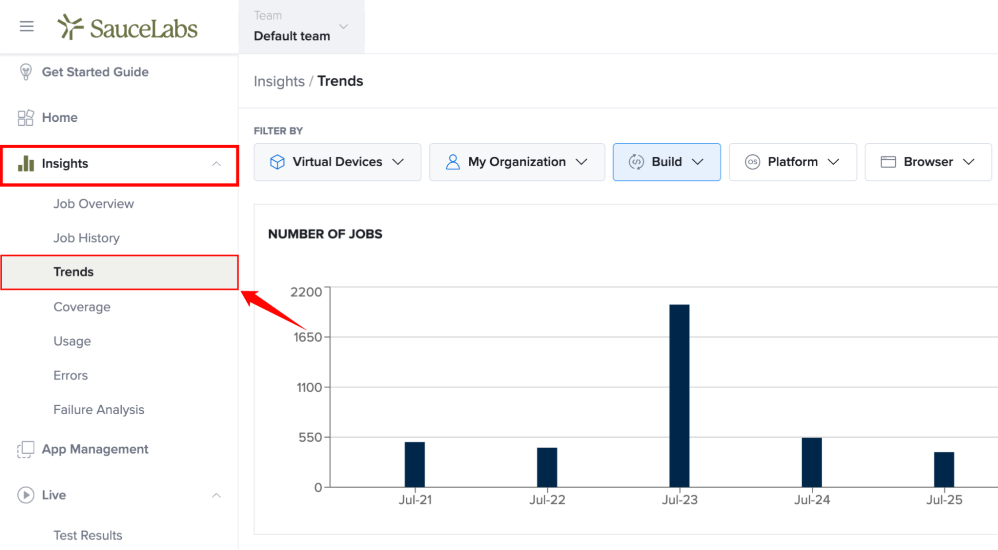
Step 1: Inside your Sauce Labs account, from the left-hand navigation menu, expand Insights, and then select Trends.
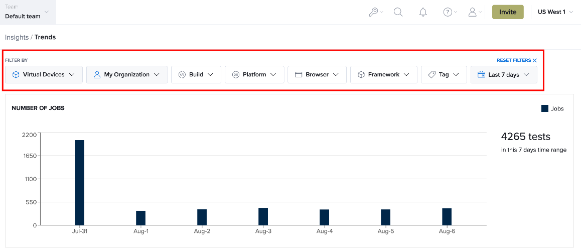
Step 2: Configure the filters to display the test results you want to analyse. For information about the available filters and how to use them, see Filter Controls for Trends.
Step 3: Review the Pass/Fail Rate graph. The graph automatically updates to display the distribution of test outcomes during the selected time period.
Each bar represents the percentage of test results recorded during a specific reporting interval.
Understand Test Statuses
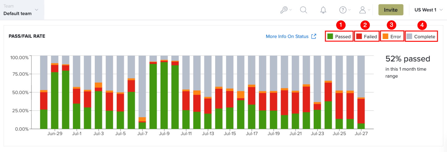
The Pass/Fail Rate visualization categorises completed test jobs into four different outcome types. These categories help you determine whether issues originate from your application, your automated tests, or your test infrastructure.
| Ref. | Status | Description |
|---|---|---|
| 1 | Passed | The test completed successfully and was explicitly marked as passed. |
| 2 | Failed | The test completed but was marked as failed because one or more assertions or validations did not succeed. |
| 3 | Error | The test did not complete successfully because it encountered a fatal error during execution. |
| 4 | Complete | The test ran to completion but did not report either a pass or fail status. |
View Test Statistics
Hover over any bar in the Pass/Fail Rate graph to view detailed statistics for the selected reporting interval. The tooltip displays the reporting date and the number of tests for each test status, including Passed, Complete, Failed, and Error.
This allows you to quickly compare test outcomes across different reporting intervals without changing the selected time range.
Analyse a Specific Time Range
If you identify an unexpected increase in failures or errors, you can investigate that period in greater detail.
Step 1: In the Pass/Fail Rate graph, click and hold the mouse button, drag across the desired time range, and then release the mouse button to zoom into the selected interval.
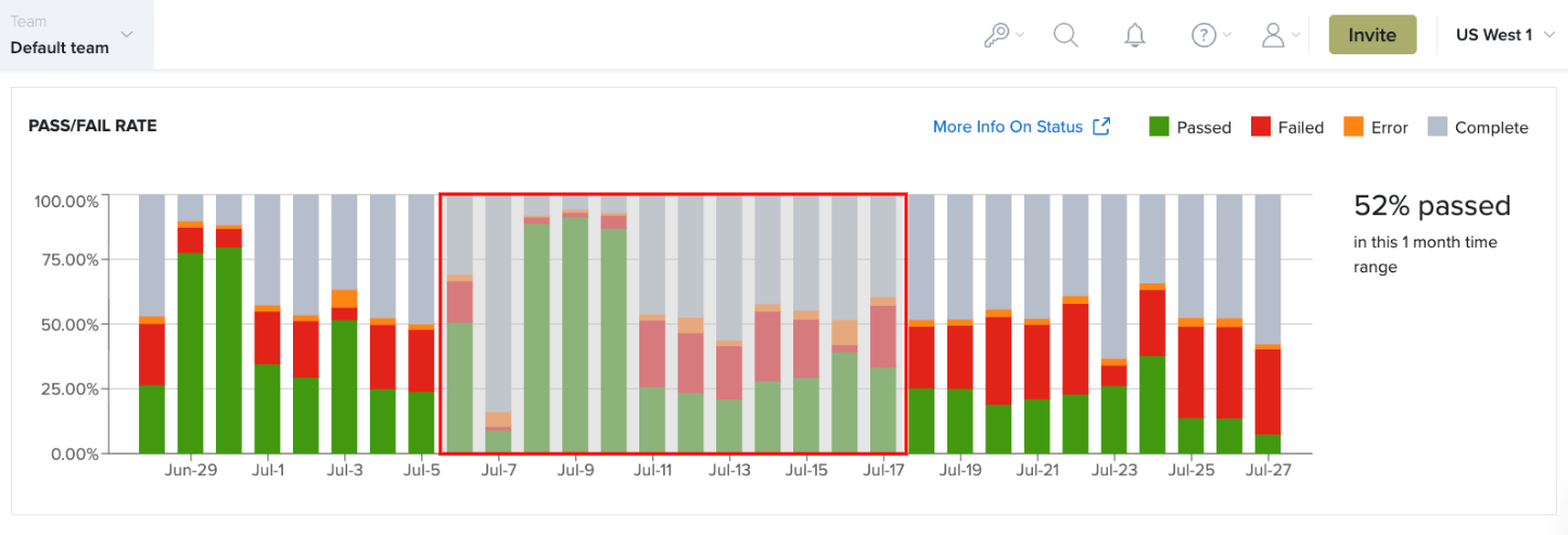
The graph automatically zooms into the selected time range and updates the displayed data, allowing you to analyse test outcomes in greater detail without manually adjusting the date range.
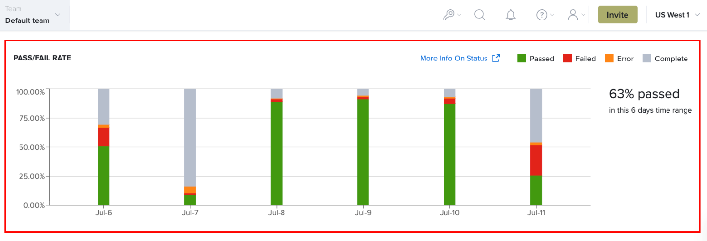
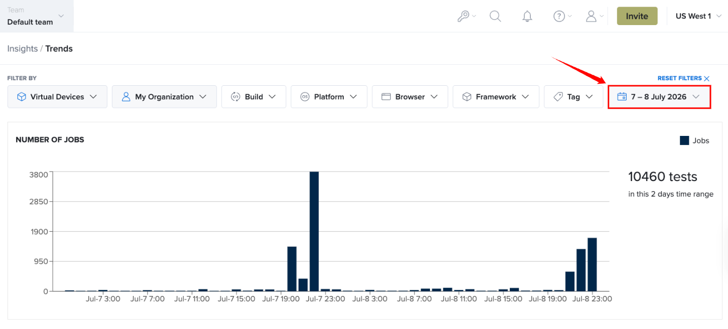
Step 2: To return to a broader view, adjust the Time Period filter or select a different date range. The Pass/Fail Rate graph automatically updates to display the test results for the selected period.
Improve Test Result Reporting
A high number of completed tests usually indicates that tests are executing successfully but are not reporting a final status.
Without an explicit pass or fail result, it becomes difficult to accurately measure application quality and compare testing trends across releases.
To improve reporting accuracy, ensure your automated tests explicitly report their execution status by using the appropriate Sauce Labs APIs or test framework integrations.